
Part 2 - Device usage and usability issues
As we've noted in Part 1 of the UX of university websites article, research published by the Nielsen Norman Group in January 2014 noted that "user are often frustrated or thwarted by the frequent usability problems on university websites" (from University Websites: Top 10 Design Guidelines). While we've noticed universities taking steps to better understand their users' needs, our research suggests that issues are still occurring when users browse university websites.
Over the last 6 years, members of the Peak Usability team have worked on over 15 projects for 12 universities and higher education institutions in Australia and the United States, with prospective and current students from across the globe. 10 of these studies were conducted in the last 2 years. We examined current and prospective students' needs, and unearthed numerous issues that occurred when users' needs for information were not met. This article focuses on which devices students use for particular tasks, and common issues current and prospective students have as they navigate through university websites.
Device usage
It is important to understand that current and prospective students are heavy users of mobile and tablets – but not for all tasks. Here are some common tasks students want to accomplish on university websites and the device type they often use for these tasks.
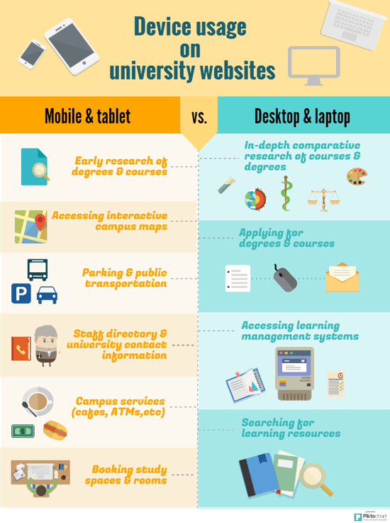
Mobile and tablets
Our research across a range of universities revealed that students often use mobile and tablet devices for quick access to information rather than completing in-depth processes.
- Conducting early research on degrees and courses - Information on degree and course offerings. Are the courses that they are interested in available at that university? (Note: This is more important for mature aged prospective students who are currently working and less important for current Australian year 12 students who often use a computer or laptop at school or home for this task).
- Accessing interactive campus maps - Maps they can interact with while they walk around campus.
- Investigating parking and public transportation– Information on the amount of parking available on campus, where they can park, and what public transportation is available.
- Accessing staff directory and university contact information - A list of staff and university offices.
- Viewing campus services e.g. cafes, ATMs, etc. (including open hours) - An overview of what else the university has on campus, beyond classrooms and staff offices.
- Booking study spaces and rooms - Information on what rooms can be booked out, how to book study rooms or spaces and where they are located.
Laptops and desktops
We found that although students did conduct quick information searches on laptop and desktop computers, the general trend is to use these devices to complete more time-consuming tasks.
- Conducting in-depth and comparative research of courses and degrees - Detailed, specific information on courses e.g. the credit point listing for core courses versus electives, side-by-side degree comparisons within one university or across multiple universities.
- Applying for degrees and courses - The actual, step-by-step process of applying to a particular university degree (Note: whether the application process was completed directly through a university website or via a tertiary admissions centre - students mentioned that the actual application process was generally done using a laptop or desktop).
- Searching for learning resources e.g. library catalogue - Sifting and sorting through numerous library systems or journals when conducting research for an assignment.
- Accessing learning management systems - More specifically, the process of downloading course documents and uploading completed assessments (Note: This is only relevant for current students).
Issues
As we alluded to in Part 1 of this article, issues can occur when users are looking for particular information, and it is not readily available. Looking back on our research, we found that these issues naturally fell into overarching themes.
Home page designs do not reflect user needs
As we've noted in Part 1, Randall Munroe published a fantastic Venn diagram that perfectly articulates the mismatch between what's offered to users on university homepages and what information users actually look for on the site.
Our research has shown that when it comes to university homepages…
- Students don't care about news!
- Students don't like large marketing banners and promos…especially when the banners push key functions and content below the fold e.g. finding a course or degree. Which leads into…
- Students really want quick access to degree information!
Terminology and language
It wasn't just international students that had trouble with the terminology and language used on university sites – we found that this issue is common for both domestic and international students, current and prospective students, and undergraduate and post-graduate students.
- University jargon causes issues for prospective students e.g. 'program' (instead of degree), 'undergraduate.' Even the term 'undergraduate' is not widely understood by prospective students still at school.
- Acronyms and abbreviations e.g. CP (Credit Point) - are difficult for both domestic and international prospective students to comprehend, as they do not have prior knowledge of what may be "common" abbreviations for a specific university.
- Poor readability e.g. large chunks of wordy text that are hard to understand. Also, current and prospective students have trouble scanning for key content when descriptive headings are not used.
Inconsistent user experience across university sites
When current and prospective students notice an inconsistent visual styling of websites, especially in relation to the treatment of content styling, our research found that there is a high probability that task completion rates will decrease, and that the overall user experience will depreciate.
- Be wary of silos! These are separate "sitelets" for different sections of the university e.g. scholarships, schools/faculties, current and future student sites, and higher degree research, that have poor cross-linkages and inconsistent visual styling.
- An inconsistent mobile experience, e.g. where one sitelet is mobile optimised and another is not, will have a negative impact on students' perception of the university.
Findability, information architecture and navigation
This is the most important set of issues - simply because if students can find what they need, they may go to another university to find that information.
- Badly presented course/degree search result pages can overwhelm users and encourage them to go to other university sites.
- Non-existent or poor cross-linkages between sitelets e.g. current and future websites, or scholarships and higher degrees research, or fees calculators and course pages. When links to items that students associate with each other are not clearly visible, students can become frustrated and will often resort to "pogo-sticking" around the site to find information.
- Poorly structured information that does not align with current or prospective students' mental models. Information architectures are often aligned with university structures - this can create a mismatch of students' expectations on the location of key pieces of content.
So does it really matter that much if they want to study with us?
The simple answer is yes! For one recent comparative study we did with 18 prospective students comparing 4 university websites, users' motivations to attend a particular university actually significantly increased or decreased when we compared their first impressions of the site (after 5 seconds) with their post-test impressions (after attempting a number of common tasks). Some users were actually more motivated to attend a competitor university after they had a great online experience with that university. You would be surprised what judgement users make about the credibility and reputation of a university based largely on their website experience.
Hence, our advice to universities is to always strive to better understand your users in order to reduce the amount of issues and roadblocks and ensure you look at your overall user experience rather than just focussing on the visual design and first impressions.
Want to learn more?
Our researchers have state, national, and international university user experience research experience spanning 3 decades. We know universities and how they work and we want to share our knowledge with you, so get ready for a special, university-focused edition of our user experience training! Visit the Training section of our website to learn more about our UX courses.